Behind the designs of our Ponderosa Point project
Welcome and come on in! We are thrilled that you are here, and cannot wait to share more details of our Ponderosa Point project with you. We are beyond appreciative of your interest and comments on social since the reveal, so we thought the blog would be a great place to expound on the process, plans, details and of course, products found throughout. Today we’ll be starting with the Kitchen and the Great Room. We’ve got a lot of ground to cover, so let’s get started!
KITCHEN

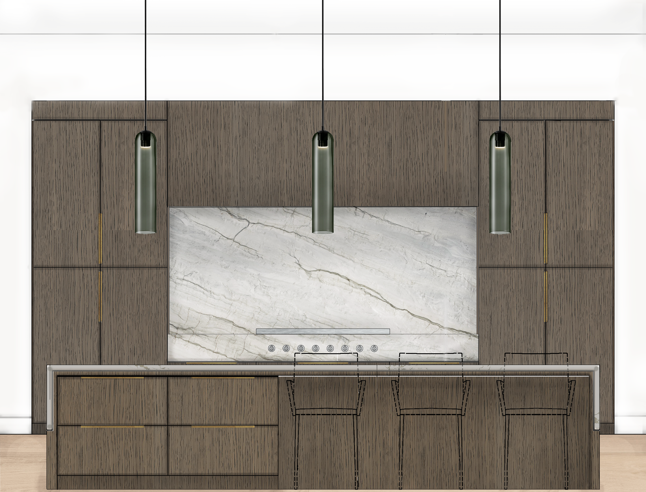
Let’s to start in the kitchen since it’s the nucleus of the home. This room is often the planet around which most families revolve, which is why we put great care into the designs of this space. First, our client knew they wanted the kitchen to open up to the living area with a high ceiling, and bold taste. They also wanted an influx of natural light which is why the windows play a huge role in the look and feel of this space. Harnessing and showcasing natural light is always incredibly important in any of our designs. We chose Sherwin Williams Alabaster for not only the wall paint color, but also the trim and ceiling color for to accentuate that open feel, while providing warmth and softness. It also functions as the perfect canvas for layering other tones and textures. All of the windows are covered in Hunter Douglas roller shades to add that perfect contrast and comfort.
We love using design elements that reflect nature, so you’ll notice those elements in the wood-look floors, white oak and rich green cabinetry, and stone countertops throughout. One of our favorite touches is the boldness of the rich green cabinets, which were painted Benjamin Moore Tuscany Green. The island dimensions were chosen so that we could use one full slab of the Della Terra Quartz Silver Stallion which eliminates the need for any seams in the stone. Further, a combination of brass and black fixtures were chosen to add a mid-century modern flair to the space. Last, the cozy, yet durable leather barstools are perfect lounging, eating, and socializing in. To this day, our client says that most of the time spent in their Great Room/Kitchen is spent in those stools.
Design Takeaway: Before your build or renovate, pay attention to how you and your family function in the kitchen. From small things like how you prepare your coffee or tea to where you tend to chop veggies and proximity to a trash can. All of the little details will inform how you should layout your space.
Design Sources:
- Floors: Bedrosians Tile Cerdomus Othello Clay 8×48
- Shades: Hunter Douglas Designer Roller Shades
- Paint: Sherwin Williams Alabaster
- Cabinets: Natural Flat Sawn White Oak and Painted Benjamin Moore Tuscany Green
- Countertops and Backsplash: Della Terra Quartz Silver Stallion
- Hardware: Top Knobs Lydia Pull – Honey Bronze
- Island Pendants: Lamps Plus Felton Black Aluminum and Wood 12″ Wide Pendant
- Faucet: Brizo Litze SmartTouch Pull-Down Faucet with Arc Spout and Knurled Handle
GREAT ROOM

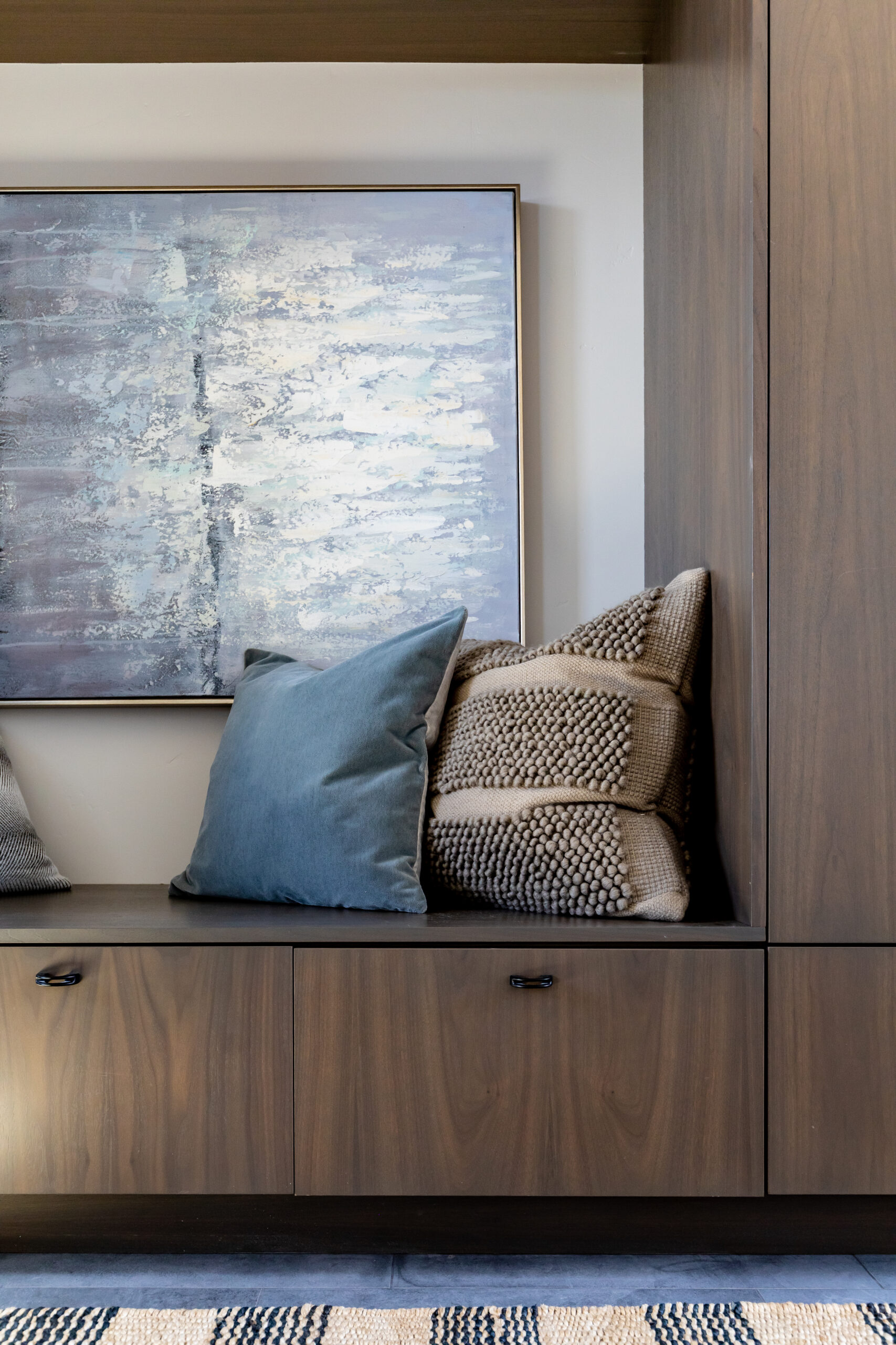
One of our favorite parts of interior design is creating interesting architectural details. It’s an aspect of design that’s typically not recognized or understood, and yet it can make the biggest impact in good designs. In our Ponderosa Point project, you’ll notice this done in the fireplace. Our client wanted a large, bold hearth for lounging and spare seating, with a large and classic stone fireplace. We took those notes, and created this beautiful hearth that wraps the entire fireplace pop out, while extending out into a full bench which is actually just smaller than a twin size bed. Pulling the natural white oak back in with that hearth top and floating shelves unified this room with the adjacent kitchen.
The room’s texture is another detail that makes it so welcoming. That is accomplished through the mix of layers and textiles. We started with a natural, woven rug sourced from Surya. Then, juxtaposed its lightness with two comfortable blue chairs, and a rich, brown leather ottoman. Pulling further lightness into the sofa then opened up and softened the furniture pieces in the space. The softly colorful stone also functioned as a beautiful backdrop to the space while adding depth to the color palette.
Design Takeaway: Don’t be afraid to do something a little unique or different! As long as you balance and curate the palette intentionally, bold details will be what makes your home stand out and be unique! Good design isn’t about copying what the neighbor did, but rather about designing every detail intentionally and not being afraid to take risks. Get creative with fabrics and finishes that complement but don’t clash!
Design Sources:
- Floors: Bedrosians Tile Cerdomus Othello Clay 8×48
- Shades: Hunter Douglas Designer Roller Shades
- Paint: Sherwin Williams Alabaster
- Floating Shelves and Hearth Top: Natural Flat Sawn White Oak
- Fireplace Stone: Stone World Highland Grey
Whew! That’s it for today’s tour. In a few weeks, we’ll be sharing more about this beautiful home’s laundry room, owner’s bedroom/bathroom, powder bathroom, etc.. Stay tuned!