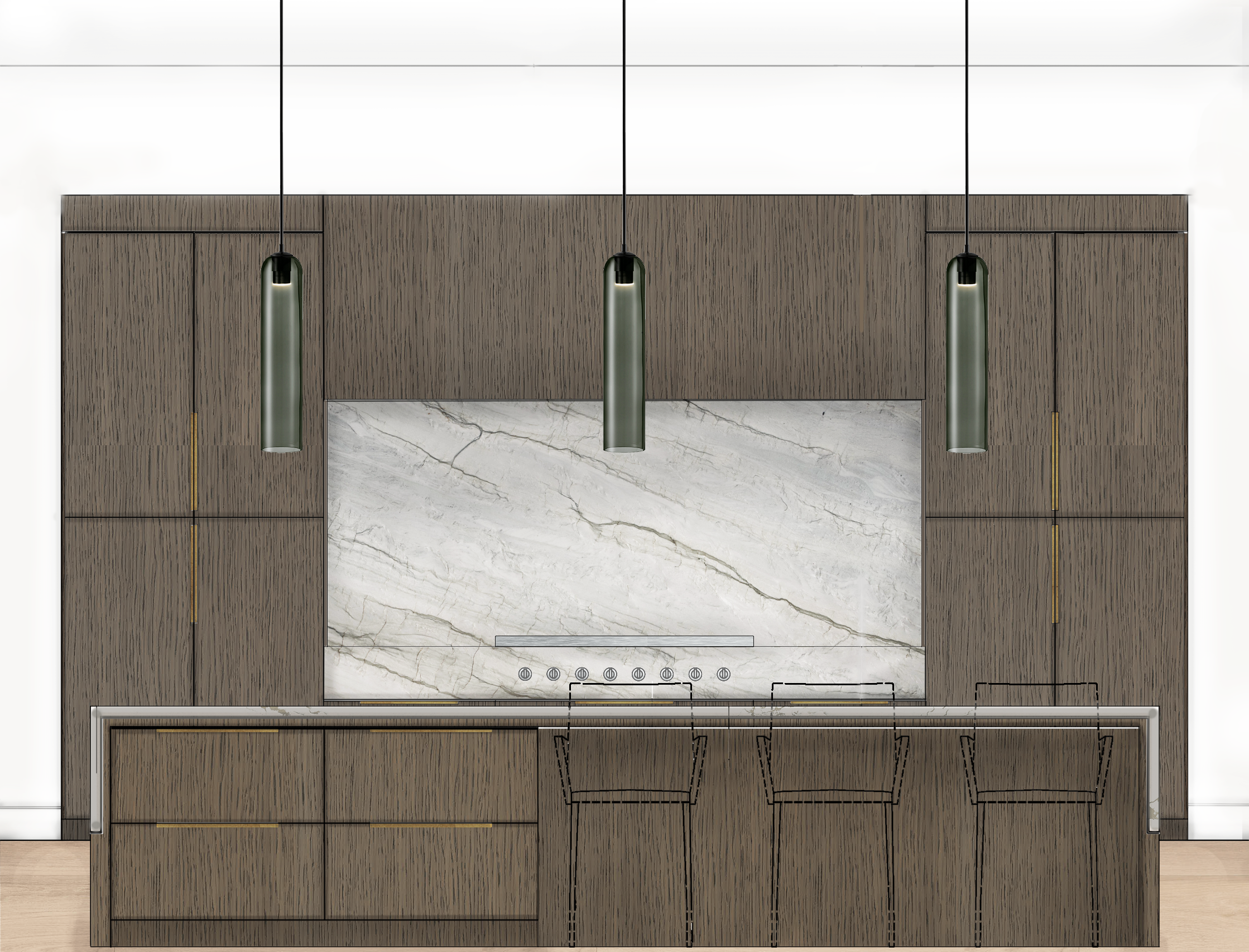
Psychology of color in Interior Design
Have you ever noticed yourself feeling a specify way in a space, without knowing why? You walk into a room and instantly feel anxious, energized, calm, or happy? What people often don’t recognize is that the colors used in any form a room has the ability to affect our psychology in major ways.
Often when we think of color in relation to interior design, we consider how the hues look. Obviously, you don’t want a design scheme where the colors conflict with each other. But you also need to take into account how the colors you use in a room will make you feel.
Color theory isn’t limited to interior design, of course. It applies to fine arts such as painting and photography, advertising and branding, fashion, beauty, industrial design, and many other fields. It even plays a role in wide-ranging cultural trends—think of how the dull olives, grays, and neutrals of World War II fashion and design gave way to poppy pastels in the prosperous 1950s, which then evolved into vivid neons in the psychedelic ‘60s. In those cases, the popular hues of the time were dictated by the mood of the nation. But it’s important to understand color meaning in interior design because we spend so much time in our homes, and the ambiance we create there has a huge influence on our everyday mood and lifestyle. It also impacts people who come into our home—it can be a place of welcome or a place that is cold or chaotic.
So how does each color impact our emotion? Read below to find out!


RED
Red emotes feelings of energy, war, danger, strength, power, and determination, but also passion, desire, and love. The various shades of red are light red, which represents joy, sexuality, passion sensitivity, and love. Pink, which signifies romance, love, and friendship. Reddish-brown is associated with harvest and fall, and dark red is associated with vigor, willpower, rage, anger, leadership, courage, longing, malice, and wrath.
Interior designer, Denna McLaughlin of City Studios, says, “Red is never boring.” It is an excellent accent color, you can use it to make a ‘cool’ room warmer; red is great for kitchens and it is known to increase appetite (which is also why you’ll often see red used in restaurants), and red accent walls can change the way a room is perceived. As the most intense color, red raises a room’s energy and is a good choice when a homeowner wants to stir up excitement, particularly at night. Red stimulates conversation and creates a strong first impression.
ORANGE
Orange is associated with joy, sunshine, and the tropics. It represents enthusiasm, fascination, happiness, creativity, determination, attraction, success, encouragement, and stimulation. It is the only color to take its name from an object; the orange. It is a somewhat polarizing color, and people either love or hate it. In ancient cultures, orange was thought to increase energy levels and heal the lungs. But, dark orange can also mean deceit and distrust. Red-orange corresponds to desire, sexual passion, pleasure, domination, aggression, and thirst for action. Gold, a distant variation of orange, evokes the feeling of prestige; the meaning of gold is illumination wisdom and wealth. Leatrice Eiseman, color expert and executive director of the Pantone Color Institute, and author of the book “Colors for Your Every Mood” says, “Orange has steadily progressed up the ladder of consumer preferences, so there’s a greater appreciation for the color.” Like red, orange stimulates appetite and is a great kitchen and exercise room color. An apricot or terra cotta orange (increasingly popular in the mid-west) can be relaxing. Bright orange adds warmth and adventure, but can be overpowering if used excessively.
YELLOW
Yellow is the color of sunshine and associated with joy, happiness, intellect, and energy. It is an excellent choice for kitchens, dining rooms, and bathrooms. In hallways, yellow can feel welcoming. However, studies show that people are more likely to lose their temper in an all-yellow interior, so it should be used sparingly. Dull or dingy yellow represents caution, decay, sickness, and jealousy and is rarely used in interior rooms. Light yellow is associated with intellect, freshness, and joy, and is a great outdoor house paint. Bright yellow evokes optimistic feelings. Interior designer, Jennifer Agus, of Agus Interiors says, “Yellow is an uplifting color, but you really have to pick the right shade. You want to make sure it’s not too bright or too muted…” But, for a sophisticated look, use deep yellow and gray. Yellow with orange are excellent choices for breakfast spaces, and yellow is great as an accent color in small quantities.
GREEN
Green is the color of nature. Considered the most restful color for the eye, green can transcend a sense of calmness and security when used in interior design. Green symbolizes growth, harmony, freshness, and fertility, and generally makes people feel emotionally safe. Green is well suited for every room in the house and can have a calming effect when used as the main color for decorating. Pairing light green with grey can create a modern feel, and using different shades in one room can add contrast. But, the various shades of green can evoke completely different feelings. Dark green is associated with ambition, greed, and jealousy, while aqua is associated with emotional healing and protection. Yellow-green can indicate sickness, cowardice, discord, and jealously, while olive green is the traditional color of peace. Interior designer, Shannon Kaye, says, “You can decorate an entire room with greens and have contrast, drama, richness, and balance. It’s so versatile.”
BLUE
Blue, by far, is the most popular color in the US and is associated with trust, loyalty, wisdom, confidence, intelligence, faith, truth, and heaven. Blue slows down the metabolism and has a calming effect, so it is considered to be beneficial to the mind and body when used in the home or office. It is said that blue will help bring down blood pressure and slow the heart rate. Light or pastel blue can create tranquility and is associated with health, healing, understanding, and softness, but can come across as ‘chilly’ on the walls in a room that receives very little natural light. Dark blue represents knowledge, power, integrity, and seriousness. Deep midnight blue can create a feeling of luxury when used in a bedroom. Sapphire blues can be great as accent colors. Jackie Jordan, the Director of Color for Sherwin-Williams says, “Those brighter French blues and sunflower yellows are a fun combination for a kitchen.”
PURPLE
Purple, in its darkest values, is dramatic, rich, and sophisticated. It can give a design scheme depth and is associated with luxury and creativity. Lighter values of purple, such as lavender, can add a restful quality to a bedroom. Plus, about 75 percent of pre-adolescent children choose purple over any other color. Interior designers use purple to add drama, create a hip feel by combining purple, pastels, and modern art; add a bold statement with neon purple, or give a room a mysterious feel with dark purple as an accent.
Interior design color psychology is essential for a beautifully balanced home. Contact us for help curating the perfect color palette for your home.